Three branding lessons we learned from the newly unveiled PWHL teams


The GIST: In sports business, a team’s brand identity is everything. A good team logo is instantly identifiable and the basis for not just merch sales, but community buy-in. Although it’s a very young league, the PWHL continues to lead a masterclass on sports branding and its newest drop is evidence of that.
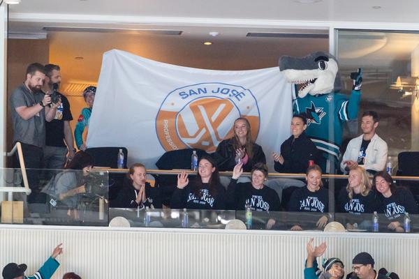
- Heading into its fourth season, the PWHL released the official names, logos, and colors for the four newest franchises: the Detroit Clutch, Hamilton Havoc, San Jose Sea Lions, and Vegas Vanguards. For women building careers in the sports industry, this rollout is a living case study in modern brand architecture, operational pacing, and storytelling.
Here are three takeaways to bookmark:
1️⃣ Women-led design teams prioritized authenticity: Even with so many brands to unveil simultaneously, EVP of business operations Amy Scheer was committed to doing a majority of the work in-house. Talk about hiring the right people — the PWHL developed the entire Detroit and Hamilton branding, an unbelievable feat for such a new front office.
- The league then partnered with Doubleday & Cartwright — the same agency that worked on the Golden State Valkyries’ iconic brand — for the Las Vegas and San Jose identities.
2️⃣ Merchandising opportunities aligned with supply chain realities: Like Seattle and Vancouver’s expansion team rollouts, these cities will start with simple jerseys instead of ones with the new logos. This two-pronged rollout is also influenced by manufacturing times, especially with the logos being unveiled just weeks before the season starts.
- The league was still ready with branded apparel and accessories in its online store to capitalize on the momentum of the reveal, and coordinated fan parties in the new cities to increase excitement. This staggered drop helps create year-round sales cycles and introduces limited, first-edition jerseys.
3️⃣ Hyper-local storytelling is better than drawing on the existing branding of men’s teams: The PWHL has always been distinct. Where women’s teams were previously designed to mimic existing men’s teams, this league stands out for its individuality.
- Detroit Clutch honors the city’s automotive legacy and sneaks in a nod to Motown with a hidden vinyl record, while the Hamilton Havoc color palette is already bringing in new fans and the forged steel peregrine falcon is a big IYKYK.
- The San Jose Sea Lions play to wildlife lovers while paying homage to a pioneer from the West Coast Negro Baseball Association, and the Vegas Vanguards stirred conversation with a controversial green but its desert motif celebrates a different side of the city that locals will appreciate.
The takeaway: The PWHL is actively writing a new playbook for expansion in order to build loyalty and to prove that fans want more than generic branding. It’s a practice we can all mimic whether it’s through a campaign pitch, product launch, or social series.
Enjoying this article? Want more?

Sign up for The Call Up and receive sports industry intel straight to your inbox two times a week